Capita is one of the UK’s largest business process outsourcers — a company of 34,000 people delivering essential services to governments, councils and some of the country’s biggest organisations. The website needed to reflect where the business was heading, not where it had been.
Part One
Shifting the narrative
Capita was actively repositioning itself — moving the conversation away from traditional outsourcing towards a technology and data-led offer — and the website hadn’t caught up. I needed to create a visual direction that felt technology-forward and credible, while keeping the human dimension that sits at the core of what Capita actually does. Lose either side of that balance and the redesign would fail.
Part Two
Taming the architecture
Before any visual decisions could land properly, there was a structural problem to solve. Capita’s services and industries span an enormous range, citizen experience, pensions, defence, local government, utilities, learning, estates and more. The existing navigation buried this breadth in a way that made the site feel harder to use than it needed to be. Visitors landing with a specific intent, a procurement team from a council, an investor, a graduate. They all had very different jobs to do, and the site wasn’t helping any of them efficiently.
I worked through how to restructure the navigation and content architecture so that discovery felt intuitive rather than effortful. The goal was a site where the right content surfaced quickly, without requiring visitors to understand how Capita had internally organised its business. Clear pathways by service, by industry, and by audience type. Simpler, more confident labelling. Less navigation for navigation’s sake.

")


Part Three
Elevating the brand to match the ambition
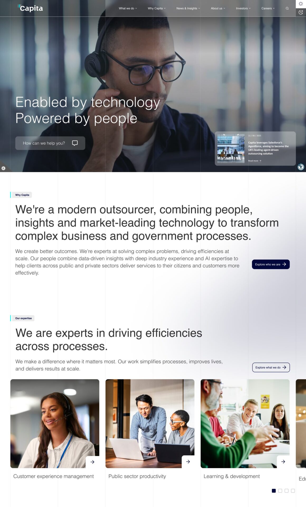
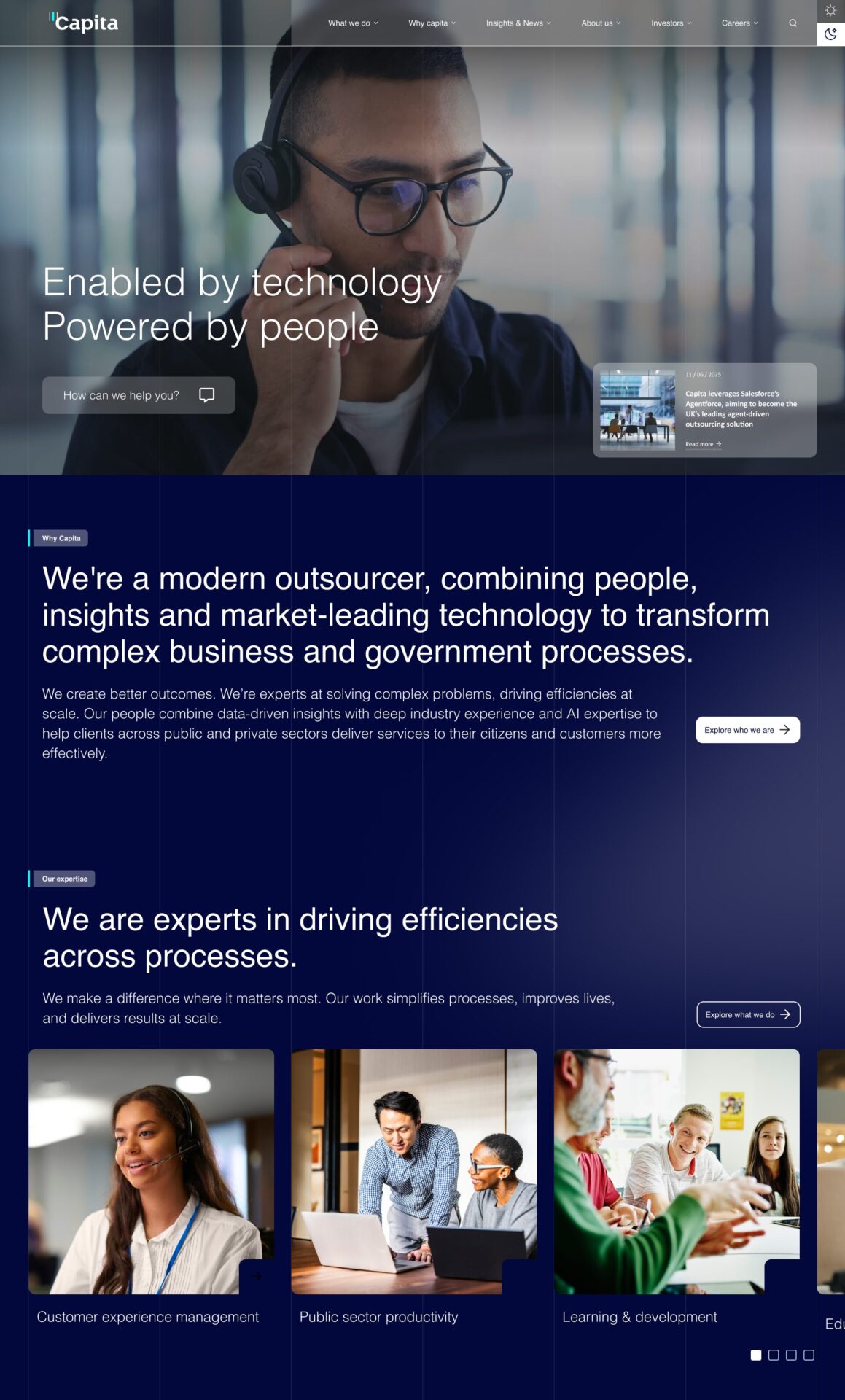
With the structure in place, the visual language needed to do real work. The design direction I landed on used the deep navy palette as its foundation — a colour that reads as authoritative and trusted in a corporate context, but also pulls in the direction of technology and precision. Against that, I introduced a typographic approach that was bold and editorial, giving the site a confidence it hadn’t had before.
Large, considered imagery was used to bring the human dimension forward — real people, real contexts, real work. The layout balanced density where content needed it with generosity of space in the moments designed to create impact. The overall effect was a site that felt like it was moving in a direction, not just sitting still.
Alongside the pages themselves, I built out the full design system — a component library that gave the wider team the tools to maintain and extend the site consistently. Every component was designed with the same tension in mind: structured and systematic enough to scale, but never so rigid that it felt cold.
Finishing touches
Through the whole process we looked to areas where we could really elevate the experience of the site and make it more engaging for the user through interaction and motion. One of these efforts was to add a toggle from light to dark mode in the header, giving the user the opportunity to decide the experience they prefer.